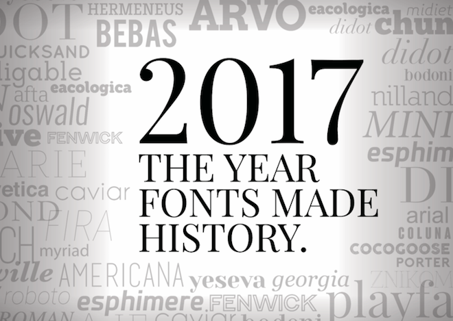
We live our daily lives pretending we don’t care about fonts. Meanwhile, we’ve all spent an hour on the Google Docs drop-down menu trying to pick the perfect serif for our final project. We even toss insults toward Comic Sans, which seems to be such an easy target that even the least design-savvy among us can bully it as the PBR of the design industry. It’s 2018. It’s time to admit that fonts are not just strange names to be listed off like sad Medill verb conjugations. It’s time to admit that we are all typographers.
Similarly, it should come as no surprise that fonts can say things beyond the meaning of the text they represent. In some cases, they can even change the course of history. Let’s rewind and take a look at all the instances in which fonts changed life as we know it. You’re in for one Helvetica of a ride!
#1: Bad typography creates the largest Oscars upset in history
At this point, it’s no surprise that La La Land lost Best Picture to Moonlight due to an embarrassing on-stage mix-up in February. Vox published this piece in March discussing how better typography could have saved the entire embarrassing debacle from happening. Instead of listing the specific award at the top, which is the first place people look, the award name is displayed at the bottom. That makes it pretty easy to accidentally substitute the wrong card without even noticing until after you’ve read off the recipient … which might be too late.
Hopefully they’ll fix that in the futura.
#2: Gilbert Baker’s death becomes the birth of a rainbow typeface
When Gilbert Baker died on March 31, it meant the end for a global icon of LGBTQ Pride (and creator of that legendary Rainbow Flag). In his honor, NewFest and NYC Pride created a font called Gilbert. It’s cute in black and white, but the cool thing about Gilbert is that it actually shows up in rainbow colors by default. Can you imagine a greater honor than being immortalized with a typeface? This is Arial big deal.
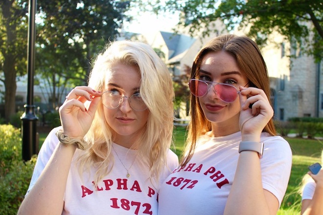
#3: Everyone’s least favorite font suddenly becomes a fashion statement
Ever heard of Cooper Black? It’s not a CLUE character … it’s a bold, rounded typeface Guardian named as The Most Fashionable Font of 2017 back in April. It’s been popping up across shirts from TopShop, Brandy Melville and even NU’s very own Alpha Phi Chapter. And to think I told my third grade science fair group that it wasn’t good enough for our tri-fold...
#4: The Prime Minister of Pakistan is outed by Calibri
As a general rule of thumb, you should always change the default font. Especially if the default font is Calibri, which was released in 2007, and the document you are printing is meant to look like it’s from 2006. Nawaz Sharif, the Prime Minister of Pakistan, was caught in July for forging a document from the 2016 Panama Papers simply due to aforementioned font suspicions.
Geez, get with the Times, dude.
#5: Taylor Swift brings revenge to a new level by roasting Kanye with a font
Taylor Swift doesn’t do anything by accident – especially not using a font similar to Kanye West’s Life of Pablo typeface for her reputation album cover. (I don’t know about you, but I screamed about both of them using Olde English Script more than when I heard “I ... don’t ... like your tilted stage.”) Fans will say it’s just another New Era in Taylor Swift graphics. Haters will say she’s mocking Kanye’s brand. Taylor will shake, shake, shake, shake off the haters.
Did Taylor try and shade Kanye with a FONT?! pic.twitter.com/8PKLVjQ5A3
— Sam Stryker (@sbstryker) August 23, 2017
#6: SNL turns everyone into font critics with one skit about Papyrus
If you think you made it all the way to October without caring about fonts, think again. A wildly successful SNL Skit featuring Ryan Gosling poked fun at the Avatar movie franchise for using a poorly-designed and overused font in their title design. Honestly, you can’t go wrong when you combine Ryan Gosling with comedy and fonts. Unless, of course, you’re Avatar, who no one can think of anymore without remembering they used a font typically reserved for vegan restaurant menus and expired spa coupons.
Just like that, SNL did something I’ve been trying to do since high school: It made hating certain fonts cool. Even more importantly, it brought attention to how all of us recognize certain fonts ... whether we consciously admit it or not.
So, as I’ve been saying: It’s a font’s world. We’re all just typing in it.