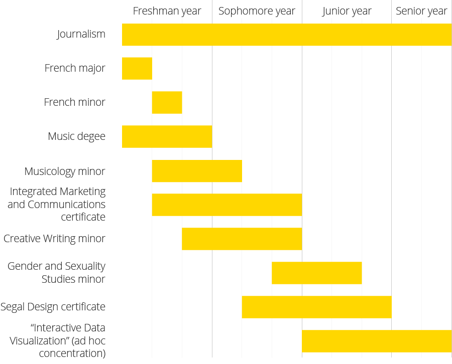
Over the last four years I replaced my fear of math with a love for data – specifically, data-driven graphics. In my most #onbrand piece of NBN content yet, here are three graphs of my Northwestern experience made with real data. (Thanks Facebook archives.)
1) How many friends I thought I’d make vs. how many I actually made:

2) Proof that inviting everyone on your friends list to your fundy/rager/”study” party really works:

3) Every major, minor and certificate for which I filled out the paperwork to declare it and enrolled in a required class:

